Flexbox
Created: 2022-11-19
Flexbox is the short name for the Flexible Box Layout CSS module,
Designed for one dimension layout — either as a row or as a column.
Items flex (expand) to fill additional space or shrink to fit into smaller spaces.
To use flexbox,
- you apply
display: flexto the parent element of the elements you want to lay out;
all its direct children then becomeflex items.
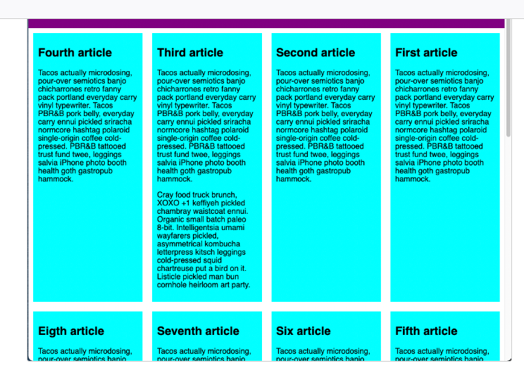
The <section> element becomes a flex container
Its children becomes flex items.
section {
display: flex;
}
.wrapper {
display: flex;
}
<div class="wrapper">
<div class="box1">One</div>
<div class="box2">Two</div>
<div class="box3">Three</div>
</div>
Setting display: flex
Default values of display: flex
Property flex-direction of parent element has an initial value of row.
Property align-items of their parent element has an initial value of stretch.
Setting the flex property
In addition to properties that can be applied to a FLEX CONTAINER,
There are also properties that can be applied to FLEX ITEMS.
We can
- add the flex property to all of our child items,
- give it a value of 1.
This will cause all of the items to grow and fill the container, rather than leaving space at the end.
If there is more space then the items will become wider;
If there is less space they will become narrower.
If you add another element to the markup, the other items will all become smaller to make space for it; the items all together continue taking up all the space.
.wrapper {
display: flex;
}
.wrapper > div {
flex: 1;
}
<div class="wrapper">
<div class="box1">One</div>
<div class="box2">Two</div>
<div class="box3">Three</div>
</div>
Shorthand
For flex-wrap and flex-direction
flex-direction: row;
flex-wrap: wrap;
with
flex-flow: row wrap;
flex
A shorthand property of
flex-grow flex-shrink flex-basis
flex-Direction property
flex-direction: column;
flex-direction: row-reverse;
flex-direction: column-reverse;
Specifies which direction the main axis runs (which direction the flexbox children are laid out in).
By default this is set to row,
which causes them to be laid out in a row in the direction your browser's default language works in
(left to right, in the case of an English browser).
flex-wrap
flex-wrap: wrap;
Horizontal / Vertical Alignment
div {
display: flex;
align-items: center;
justify-content: space-between;
}
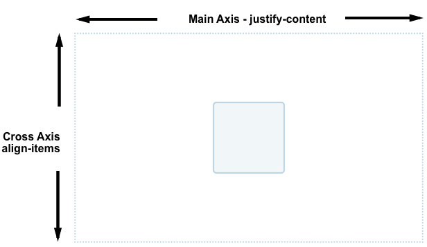
1. align-items: ; cross axis)
Controls where the flex items sit on the cross axis.
You can also have values like flex-start and flex-end, which will align all items at the start and end of the cross axis respectively. See align-items for the full details.
Values
stretch(default)
stretches all flex items to fill the parent in the direction of the cross axisflex-startorflex-end
aligns the items at start or end of cross axis
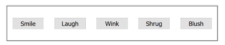
Manipulate an individual flex item
first-child is recognized from the 1st left item
button:first-child {
align-self: flex-end;
}
2. justify-content: ; (main axis)
Justify-content controls where the flex items sit on the main axis.
center is also a value for justify-content. It'll make the flex items sit in the center of the main axis.
The value we've used above, space-around, is useful — it distributes all the items evenly along the main axis with a bit of space left at either end.
There is another value, space-between, which is very similar to space-around except that it doesn't leave any space at either end.
Values
flex-start(default)
makes all the items sit at the start of the main axis.flex-end
makes flex items sit at the endcenter
well, make flex items sit at center of main axisspace-around
distributes all items evenly along main axis with a bit of space left at either endspace-between
distributes evenly but doesn't leave any spacee at either end
Ordering Flex Items
All flex items start counting at 0
first-child which is 0 will instead be now a second-child
button:first-child {
order: 1;
}
Make last item appear first
button:last-child {
order: -1;
}
The Flex Model
When elements are laid out as flex items, they are laid out along two axes:
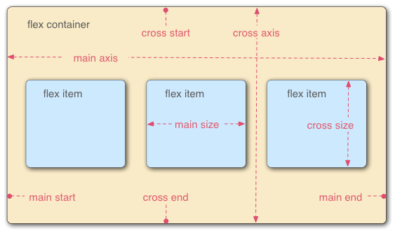
Main Axis
axis running in the direction the flex items are laid out in
(for example, as rows across the page, or columns down the page.)
Main Start / Main End
The start and end of this axis
Cross Axis
Axis running perpendicular to the direction the flex items are laid out in.
The start and end of this axis are called the cross start and cross end.
Flex Container
The parent element that has display: flex set on it.
Flex Items
The items laid out as flexible boxes inside the flex container are called flex items.
Snippets
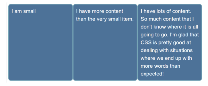
List items are all different sizes,
be display as three equal sized columns,
no matter what content is in each item.
ul {
display: flex;
}
li {
flex: wrap;
flex: 200px;
}
Any overflow is moved down to the next line